How to make a website for an AI automation agency
The whole category has the same website: a gradient, the word "leverage", and three icons. Here is how to build one that survives the first question a serious buyer asks, which is always some version of "show me one you actually did".
There is a house style in this category and it is not helping anybody. Dark background, purple gradient, a headline about leveraging AI, three icons labelled Strategy, Implementation and Support, and a calendar link.
The problem is not that it is ugly. It is that it is interchangeable, and interchangeable is the one thing a consultancy cannot afford to be.
What the buyer is actually checking
Somebody hiring an automation agency has usually been burned by a demo that did not survive contact with their data. They are checking three things, and none of them is your capability list:
- Have you done this in my industry, or at least my shape of problem?
- What happens when it gets it wrong?
- Who owns the thing you build — and can we run it without you?
That third one is the question nobody puts on their website, and answering it plainly is the cheapest differentiation available.
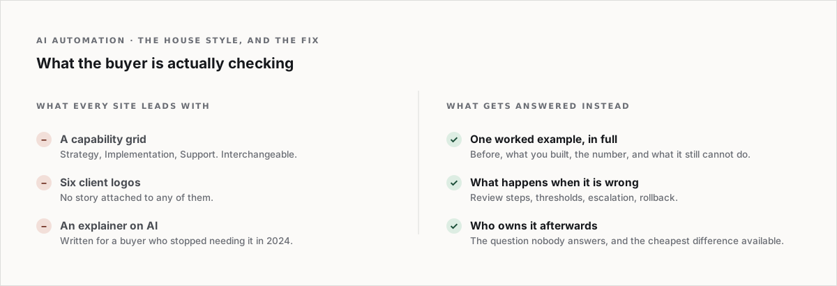
Lead with one worked example, in full
One project, told properly, beats six logos and a capability grid.
The shape that works:
- What the process looked like before. Hours, people, where it broke.
- What you built. Named tools, honestly. "Proprietary AI engine" reads as "a prompt and a spreadsheet".
- What it does now. A number, with the period it covers.
- What it still cannot do. This is the paragraph that sells. Everybody claims the first three.
If you cannot write that for a single past project, the website is not your problem yet.
Say what happens when it is wrong
Every automation built on a language model has a failure mode, and a buyer who has done this before knows it. A site that never mentions review steps, confidence thresholds or human escalation is a site written by somebody who has not shipped one.
One short section — how errors surface, who checks what, what the rollback is — moves you out of the demo-ware pile.
Pricing: say the shape, if not the number
You may not be able to publish a price. You can publish the shape: is this a fixed-scope build, a monthly retainer, a per-seat licence, or a share of the saving? Buyers are trying to work out if you are a project or a subscription, and guessing wrong wastes a call for both of you.
The part about ownership
Write down who owns the workflows, the prompts and the data when the engagement ends. Most agencies are fine on this and simply never say it, which leaves the reader assuming the worst because the last vendor was not fine on it.
What to cut
- The AI explainer section. Your buyer knows what a language model is. If they do not, they are not buying this year.
- "Trusted by" with six logos and no story. Pick one and tell it.
- A chatbot on the homepage that cannot answer what you charge. It is a live demonstration of the thing they are afraid of.
Building it
Four sections: the problem you solve stated concretely, one worked example in full, how failure is handled, and the engagement shape. Then a way to talk to a person.
It is a short site. Short is correct here — the length of an agency homepage is usually inversely proportional to the number of projects behind it.

Case studies that read like case studies. Work rows, process steps, pricing blocks and proof sections you can drop in and rewrite. Browse the Market.