How to make a website for an escape room
Escape room websites fail in a specific way: they describe the rooms in loving detail and forget that the person reading is organising six people for a Saturday and needs to know price, duration and whether it is suitable for their group.
The person on your website is rarely playing alone. They are organising — a birthday, a work thing, a stag do, four friends who have not met up since March — and organisers have a different set of questions from players.
Most escape room sites answer the player's questions and none of the organiser's.
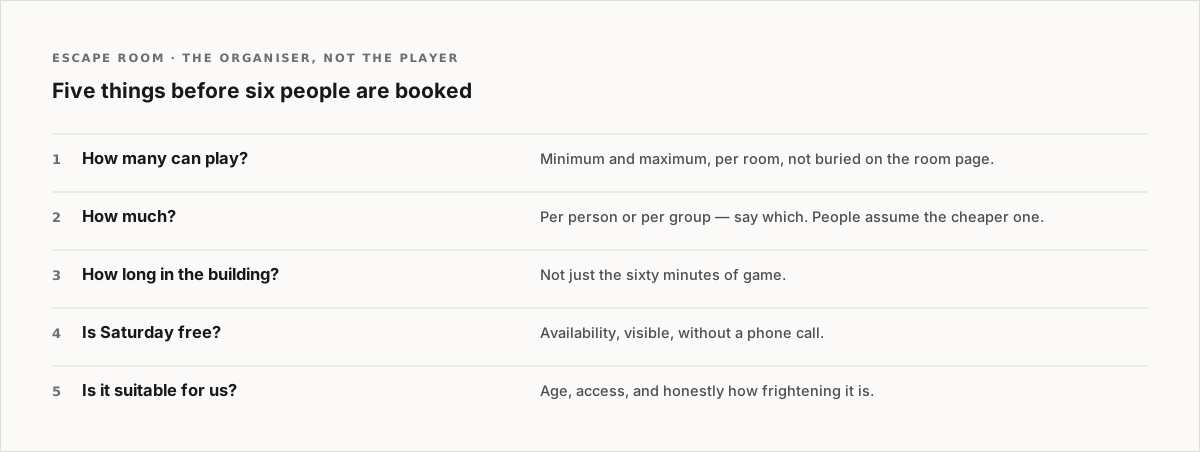
The organiser's five questions, above the fold
- How many people? Minimum and maximum, per room. This is the first filter and it is usually buried in the room page.
- How much? Per person or per group — say which, because the difference is significant and people assume the cheaper reading.
- How long? Total time in the building, not just the sixty minutes of game.
- Is there a slot on Saturday? Availability, visible, without a phone call.
- Is it suitable for us? Age limits, claustrophobia, wheelchair access, how frightening it actually is.
Rate difficulty honestly
Every room in the world is advertised as challenging. A group that fails in a way that felt unfair does not come back and tells people.
What works: state a genuine success rate per room. "About 35 per cent of groups escape" is interesting, honest and sets expectations. It also makes a win feel earned, which is the thing you are actually selling.
And say whether hints are unlimited. Groups that know they cannot get permanently stuck book more readily.
Describe the room without spoiling it
The hard writing problem in this category. What works is the setup and the feeling, never the puzzles:
- Where you are and why — two sentences.
- What it looks and sounds like.
- What kind of thinking it rewards — searching, logic, teamwork, nerve.
- What it is not. "No crawling, no darkness" helps more people decide than any amount of atmosphere.
The fear question, answered plainly
A large share of visitors want to know if anything jumps out at them. Put a clear line on every horror-adjacent room: is there an actor, is there sudden noise, is it dark.
People who want to be frightened will book anyway. People who do not will book a different room instead of not booking at all.
The group stuff is the margin
Corporate bookings, birthdays and stag and hen groups pay more and book further ahead. Give each its own short section: what you offer, what it costs, how many people, and whether there is somewhere to sit afterwards with a drink. That last one closes birthday bookings.
The local search part
"Escape room near me" and "escape room + town" are the whole game. Name the town in the copy, have a proper address, publish opening hours, and say where to park. A venue on a side street with no parking note generates phone calls instead of bookings.
What to skip
A countdown timer on the homepage. A story about how your company was founded. Long paragraphs of atmospheric fiction before the practical details — write the fiction, but put it under the price.

Booking rows, price tiers and photo rails. The sections a venue needs, built to be edited rather than admired. Browse the Market.