Portfolio website design ideas that survive a second look
Most portfolio inspiration is a screenshot with no argument attached. These are three real layouts with the reasoning next to them — what each one does with photographs, type and the one page nobody reads carefully enough.
Search for portfolio design ideas and you get a wall of screenshots. Beautiful, and almost useless, because a screenshot does not tell you why it works or whether it would work for your kind of work.
So here are three, with the argument next to each one. All three are real DragGo templates you can open and take apart, which is a more honest way to show a layout than a cropped image on a moodboard.
Idea one: scatter the images, discipline the type
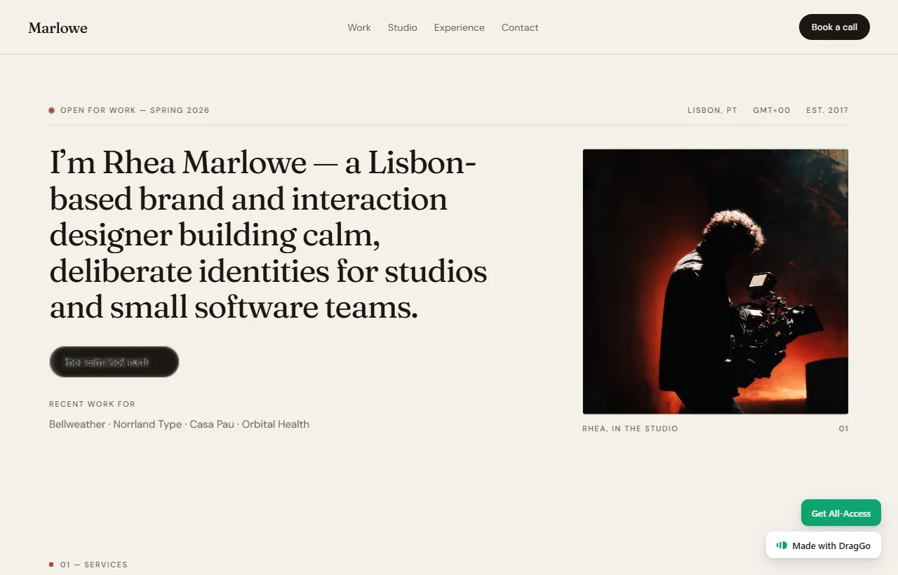
The scattered layout is having a long moment and it is easy to do badly. What holds this one together is that only the pictures are loose. The type sits on a strict scale and a strict measure; the images are allowed to break the grid around it.
Get that backwards — loose type, tidy pictures — and the page reads as a mistake rather than a decision.
Who it suits: photographers, art directors, anybody whose work is the image. It needs a real body of work. Three projects in a scattered layout looks like a page that failed to load.
Idea two: one column, and let the work be long
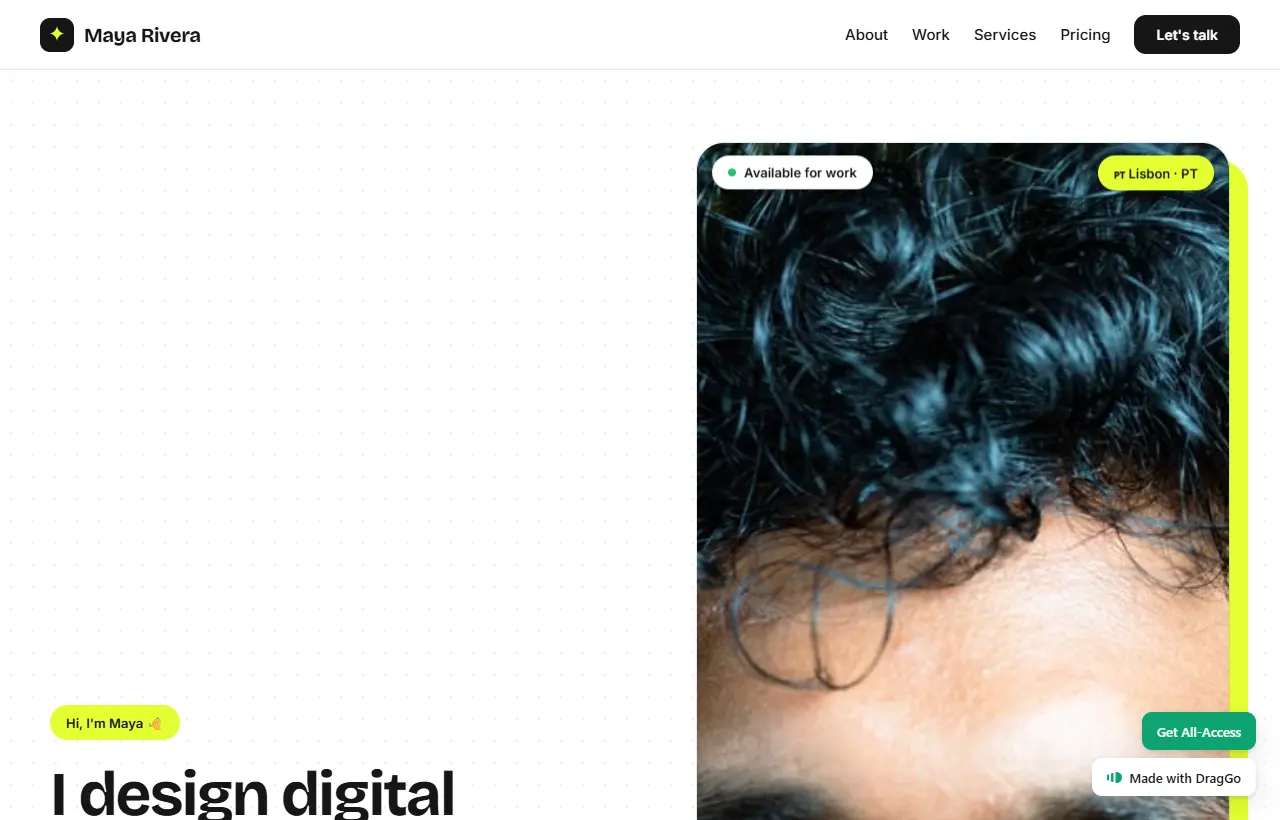
The opposite instinct, and for most people the more useful one. A single column, a clear line length, projects that go deep rather than wide.
This is the shape that wins product and UX roles, because those are hired on reasoning rather than on visuals. A grid of thumbnails shows what you made. A column shows how you decided, which is the thing the person reading is actually assessing.
Who it suits: product and UX designers, writers, engineers, anybody whose value is in the thinking. Also anybody with four projects rather than forty — depth covers for volume.
Idea three: the studio hybrid
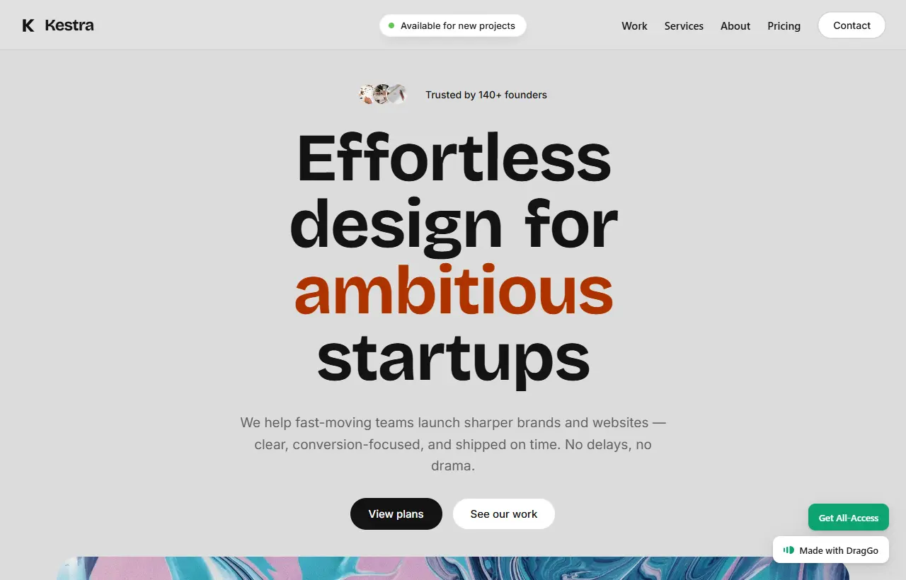
Half portfolio, half business. Work at the top, then services, then a way to start a conversation.
The move worth stealing: the services section sits after the work, not before it. Somebody who has just been impressed is ready to read what you charge for. Somebody who has not been impressed yet is not, and leading with services reads as a menu from a restaurant you have not seen the inside of.
Who it suits: freelancers and small studios who need the site to sell, not just to prove.
The four mistakes that cost the enquiry
Independent of which layout you pick:
No dates. "Recent work" that is four years old reads worse than work honestly dated. Put years on projects.
No contact anywhere but a contact page. The person who wants to hire you decided halfway down a case study. Give them somewhere to click right there.
Every project treated equally. Six projects, all the same size, all the same depth is a filing cabinet. Lead with the two you want more of.
A CV pretending to be a portfolio. If the page lists tools and years, it is a CV. Employers read those in ten seconds and remember nothing. One project explained properly beats a skills bar every time.
About picking a template rather than starting empty
Starting from a blank canvas is romantic and it is where most portfolios die. A template gives you the structural decisions — measure, scale, rhythm — already made by somebody who has made them before, and leaves you the part only you can do, which is choosing what to show and writing about it honestly.
The three above are in the DragGo Market along with forty others, and they open in the editor rather than downloading as a zip you have to wire up.

Open one and take it apart. Every layout above is a real template. They open in the editor rather than arriving as a zip. Browse the Market.
What to do this week
Pick the layout that matches the shape of your work, not the one that looks best on a moodboard. Photographs want scatter. Reasoning wants a column. Selling wants the hybrid.
Then write the case studies before you touch the design. The layout is an hour's work and the writing is the week's — and every portfolio that has ever gone stale did so because the design was finished and the writing never was.