Web design trends in 2026, and which ones to actually use
Every trend list is the same twelve items with no cost attached. These are the three shaping real sites this year, what each one costs you in performance or accessibility, and the one nobody lists because it is not photogenic.
A trend list is easy to write and hard to use, because it never says what a trend costs. Everything on a page costs something — weight, attention, or somebody's ability to read it. So here are three, each with the bill attached.
1. Editorial serif, used like a magazine
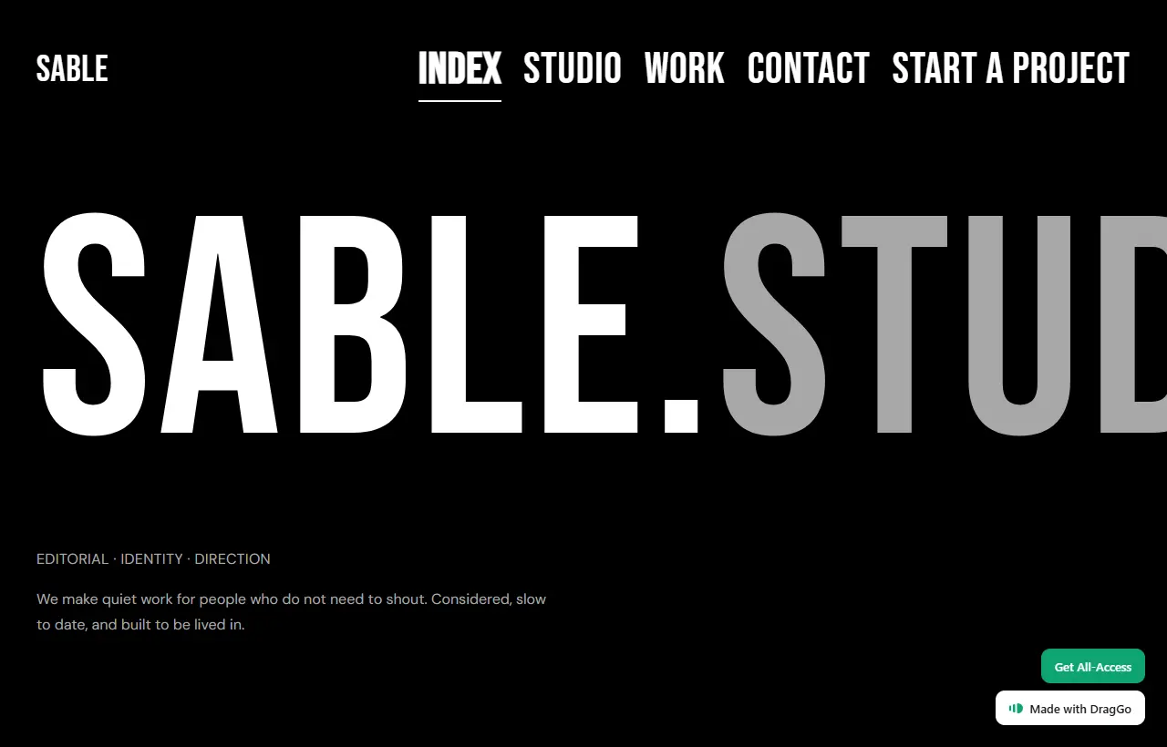
The biggest shift of the last two years, and the one with the best ratio of impact to cost. Large serif display type, generous measure, a real typographic scale instead of three sizes of the same sans.
What it costs: a font file, and discipline. The failure mode is picking a characterful serif and then setting it at the same weight and size everywhere, which produces a page that looks expensive from a distance and undifferentiated up close. If you take one thing from this trend, take the scale, not the typeface.
When to use it: anything where the words are the product — studios, writers, consultancies, anybody selling judgement.
2. High-contrast, low-decoration layouts
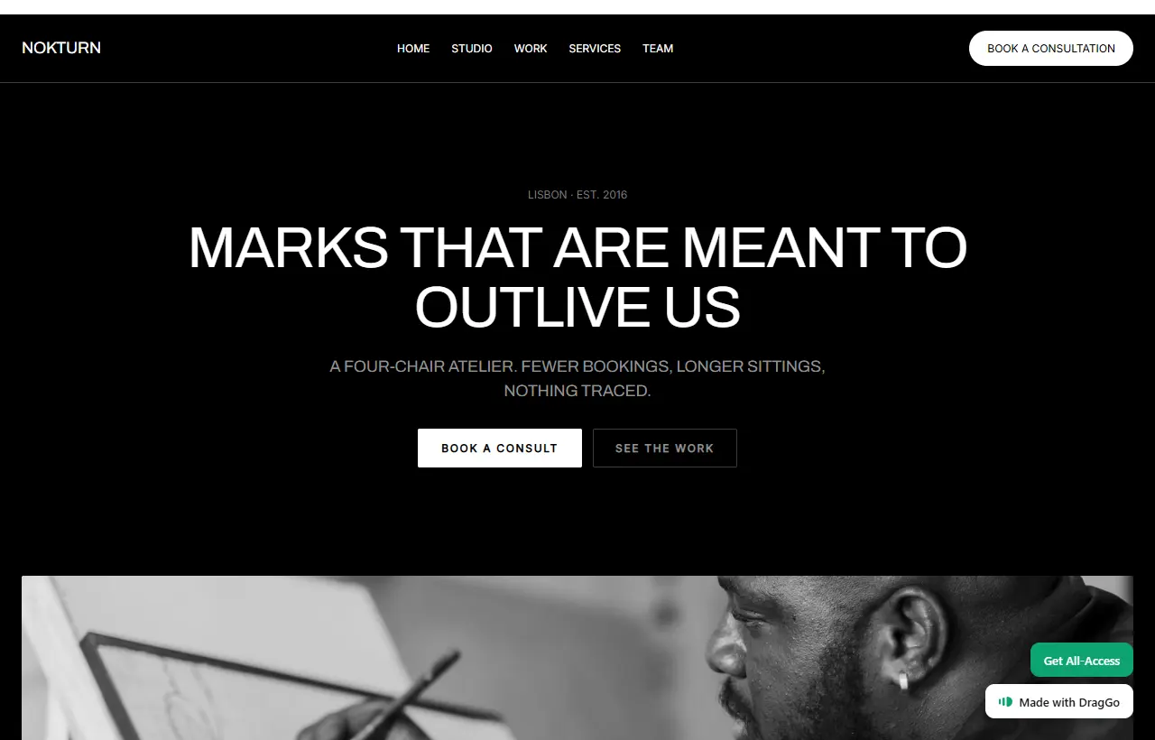
Black grounds, hard edges, very little gradient or shadow. The reaction to a decade of soft cards on soft backgrounds.
What it costs: care with contrast, in the direction people forget. Dark themes go wrong by making body text too bright as often as too dim — pure white on pure black is uncomfortable to read at length. Pull the text a step off white and the page reads better than the one that maxed it out.
When to use it: strong single-subject brands. It is unforgiving of clutter, which is a feature if your site is short and a problem if it is a catalogue.
3. Scroll-driven motion, now that the browser does it
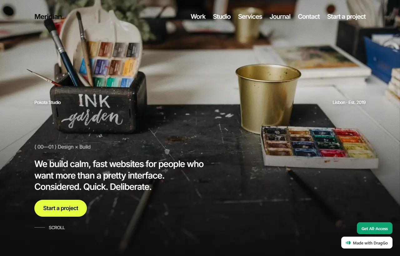
The technical change worth knowing about: motion tied to scroll position used to mean a JavaScript library and a scroll listener running sixty times a second. It is now a CSS property, it runs on the compositor, and it costs approximately nothing.
What it costs: almost nothing in weight, and everything in restraint. Cheap motion means more of it, and more of it is usually worse. The rule that has held: motion should tell the reader where they are, not that you can animate.
And it must switch off. A reader who has asked their machine for reduced motion has asked for a reason.
The trend nobody puts on the list
Pages are getting lighter, and it is the one that shows up in the numbers.
It is not photogenic, so it does not make trend articles. But the gap between a site that arrives instantly and one that arrives after a spinner is worth more than every visual trend on this page combined, and the people who obsess over it are quietly winning.
The practical version: every font file, every script, every embed is a decision you are making on behalf of somebody on a worse connection than yours.

See these three actually move. Editorial type, high-contrast layouts and scroll-driven motion, as pages you can open. Browse the Market.
How to use a trend without dating your site
The difference between a site that looks current in 2029 and one that looks like 2026 is usually depth. A trend applied to the structure — a real type scale, honest contrast, motion that means something — ages well. The same trend applied as decoration — one loud font, a gradient, a parallax hero — is a timestamp.
If you want to see the three above running rather than cropped into a screenshot, they are all in the DragGo Market as templates you can open.