How to tell a website was made by AI, and how to stop yours looking like one
There are eight reliable tells, and most of them are not about the writing. They exist because of one decision — letting the model choose the layout, which is the thing it is most average at. Here are the signs, the cause, and what actually fixes it.
People can spot an AI-built website now, and they are getting faster at it. That is a commercial problem rather than an aesthetic one: the look has started to signal "nobody cared", and a visitor who thinks nobody cared about the site draws a conclusion about the business.
What is interesting is why they all look the same. It is not that the models have bad taste. It is one decision, made in almost every AI builder, and it is fixable.
The eight tells
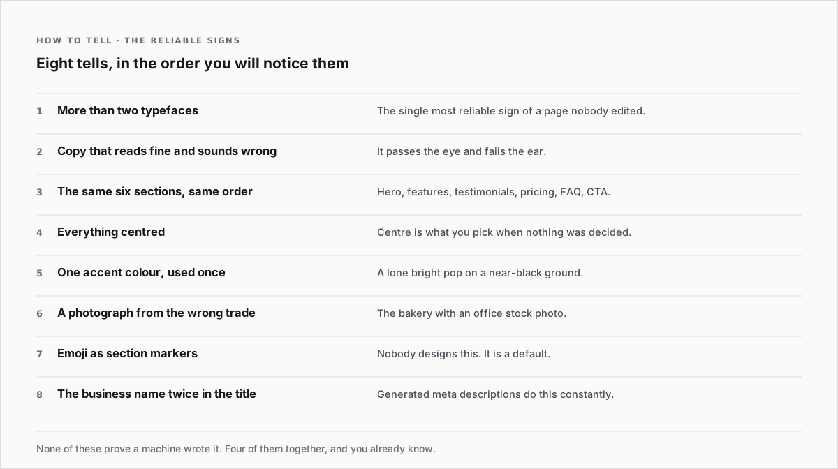
A few are worth expanding.
More than two typefaces is the most reliable single sign, and it is nothing to do with AI being bad at type. It is what happens when nobody made a decision: the hero picked one face, a section picked another, the buttons inherited a third. A human designer would have deleted two of them in the first five minutes.
Copy that reads fine and sounds wrong. Generated prose passes the eye and fails the ear. Read any page you suspect out loud and you will hear it — the sentences are all the same length, every paragraph has three clauses, and nothing is said the way a person would say it standing in front of you.
The same six sections in the same order: hero, features, testimonials, pricing, FAQ, call to action. That order is not wrong. It is just the most likely order, which is why every generated page has it, which is why it now reads as a default rather than as a decision.
Everything centred. Centre is the alignment you get when no alignment was chosen. A page where the headline, the body, the buttons and the captions are all centred is a page nobody laid out.
The business name twice in the page title. This one is invisible to visitors and obvious in a search result, and generated meta descriptions do it constantly. It is also the easiest thing on the list to fix.
None of these prove a machine was involved. Four of them together, and you already know.
Why they cluster so tightly
Here is the actual cause, and it is a single design decision.
If you hand a page to one model in one prompt, the model decides the layout. And a model asked to choose a layout will choose its most likely layout — the average of everything it has seen. Run it a thousand times and you get a thousand pages from the middle of the same distribution. That is not a flaw in the model. It is the model working correctly on a question it should never have been asked.
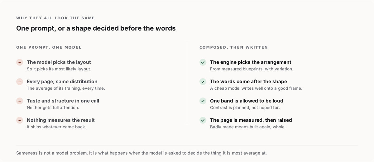
The alternative is to decide the shape before the words exist, and not with a model. Our engine picks the arrangement from measured blueprints, with real variation between them, and only then does a model write the copy into a frame that is already decided. Taste and structure stop competing for the same call.
The consequence of that split is the one people actually notice: a cheap model writes an excellent sentence, and a cheap model chooses a terrible layout. Separate the two jobs and you get good writing on a good page. Which model answers which job, and why only one of them deserves the expensive one, is the mechanical version of this article.
Two more things follow from composing rather than prompting. One band on the page is allowed to be loud, deliberately, so the page has a shape instead of an even grey texture. And the finished page is measured — if it comes out badly it is built again whole, rather than patched in the one place that failed.
If your generated site already looks like this
You do not need to start again. In rough order of how much each one buys you:
- Delete a typeface. Get to two. This alone changes more than the next four combined.
- Un-centre the body text. Headings can stay centred if you like them that way; long text should not be.
- Rewrite the first two sentences in your own voice. Say what you do to a person, then type that. The rest of the page can stay.
- Replace the one photograph that is from the wrong trade. There is always one, and it is the thing a local customer notices first.
- Change the section order. Move the thing that actually convinces people above the thing that came second by default.
- Write your own page title and meta description. Twelve words each, no business name twice.
That is an hour of work and it removes six of the eight tells.

The shape is composed before a word is written. Measured layouts with real variation, so two builds are not the same page twice. Browse the Market.
The part nobody wants to hear
Some of the tells are not AI's fault at all. Every generic website of the last decade was centred, over-typefaced and stock-photographed too; AI has simply made it cheap enough to do at volume, so we now see it constantly and have learned to name it.
Which means the fix is the same as it always was, and generation does not change it. Decide something. Two typefaces, one loud section, your own first sentence, a photograph of the actual thing. The trends worth following and the ones that just date a page matter far less than that.
The useful thing to take from this
"Made by AI" is not what visitors are detecting. They are detecting undecided. A page that was generated and then edited by somebody with an opinion does not read as AI-made, because the signals people use are all absences — no chosen typeface, no chosen alignment, no chosen voice.
So the goal is not to hide that you used a tool. It is to leave fingerprints on the result.